


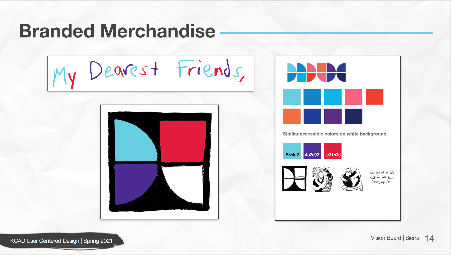
Through meetings with DisArt and collaborating with the team we needed to bridge DisArt and My Dearest Friends together for streamlining their project and initiative. Researching their already established colors and art created by Oaklee Thiele I combined these two already established concepts into one by using colors on the charcoal drawings and looking through Oaklee's letters, main part of the My Dearest Friends outreach were letters written to them then drawn by Oaklee to give even more voice to the disabled community telling their stories.

From the previous slide, we took our then concept of a sustaining logo and how that could be seen on merchandising - generic examples. Our entire team took the chance to look at the letters Oaklee illustrated and all focused on the figure holding the world, our title screen for this presentation